The first change to the trademark in the company’s history, following the merger through incorporation of CIR into COFIDE, and a new website too. These are the new developments following the birth of the new CIR.
Designed by the firm Cappelli Identity Design, who specialize in the sector of brand design, the company’s new image is modern, in line with the recent simplification of the corporate structure of the group and its growth in the service sector, while still maintaining traditional visual elements in line with CIR’s industrial culture over several decades. The logo (“CIR”) is in a lighter font and continues to use black, red and white as in the past. The trademark shows an arrow pointing upwards, symbolizing the idea of growth: its repetition creates bi-dimensional and tri-dimensional patterns that are present in all printed and digital communication.
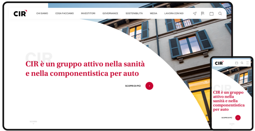
CIR’s new website (www.cirgroup.com) was designed by Alkemy, a company specializing in the creation of digital brand experiences on the web. The site prefers vertical scrolling and offers users an intuitive and simple navigation experience. The clean design, the ample use of the colour white and its graphic elements make the content more recognizable and readable, thus assisting users interested in finding further information on the group, its financial strategy, its approach to sustainability, its governance and its history.